Goldman Sachs: Charts of the year - Pasquariello
Here are a set of data points (and graphs) I collected throughout this year:
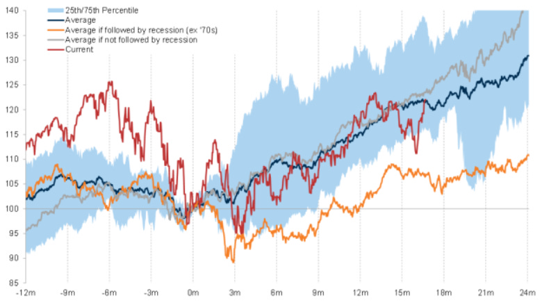
For all the quirks of this cycle, the S&P has basically done exactly what it should have done after the inflation peak (this analogy goes back to the 1950s).
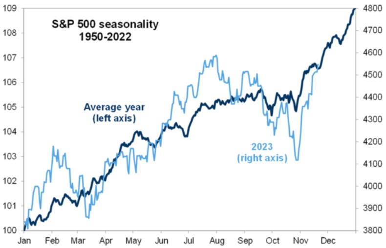
Despite all the quirks of this cycle, the S&P has basically done exactly what it should have done so far this year.
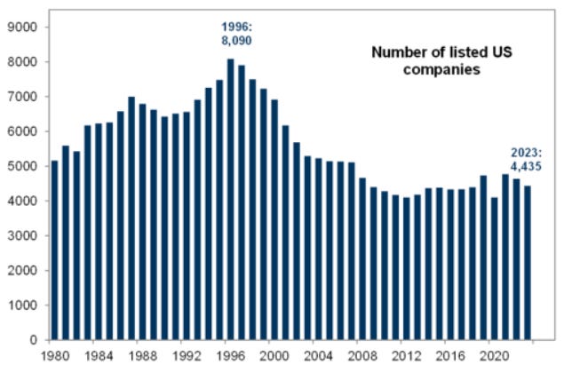
After a long period of decline, the number of publicly traded US companies showed an increase in 2019 and 2021, and is now declining again. I suspect this trend will increase next year.
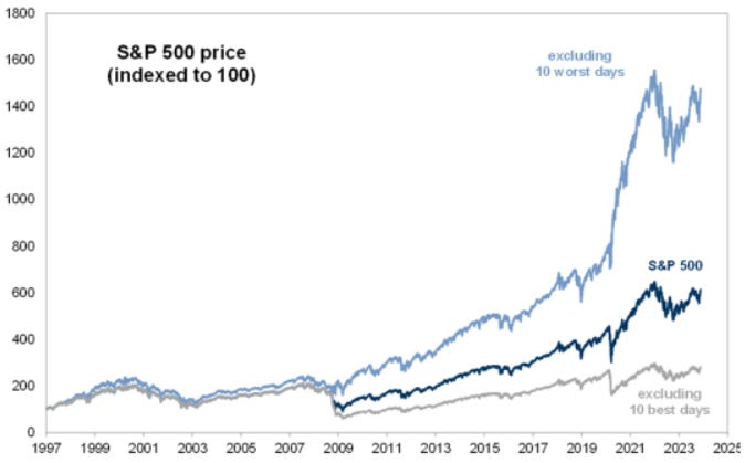
You may have seen research that suggests that you should not try to time the markets, as missing the ten BEST days seriously affects returns. While that's probably good advice for most of us, for the best traders in the world, look how dodging the ten WORST days generated a hugely impressive amount of alpha.
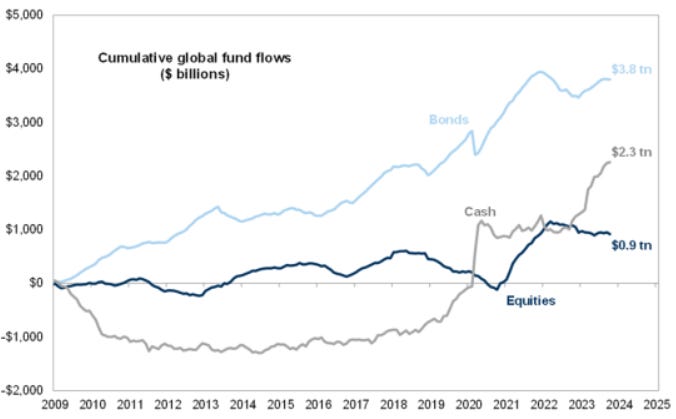
Take a step back and consider the cumulative flows into stocks, bonds and cash in the post-GFC era.
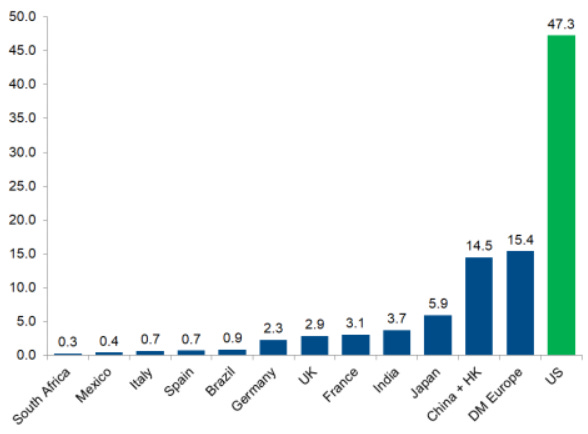
“Every year, you really have to do well in the United States, and then you more or less have to do well somewhere else.” Here you have the market capitalization of shares by country.
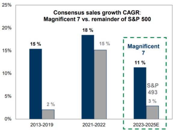
Here's a simple way, sales growth, to contextualize the exceptionalism of America's big tech companies. I'm still a fan of favoring the biggest and best over the rest.
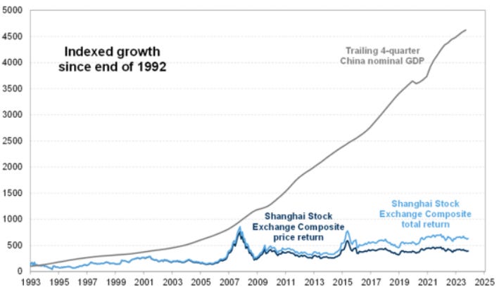
As mentioned above, an overlay of Chinese GDP growth with domestic stock market returns.
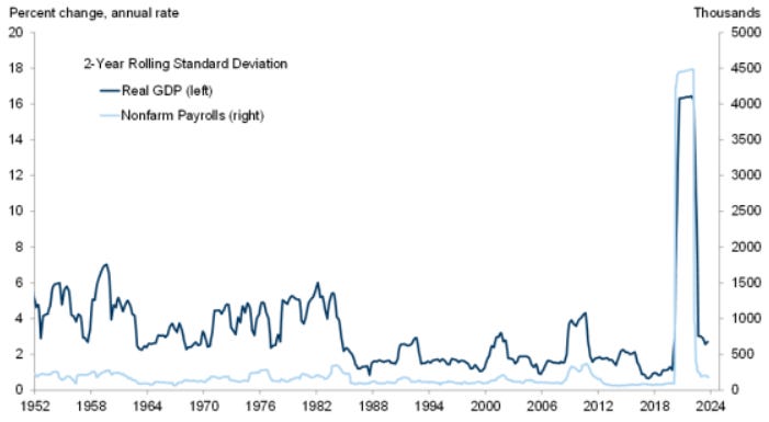
Just a few years ago, real US GDP volatility and nonfarm payrolls were at historic lows… and then COVID hit (it's pretty easy to identify). Well, as the pandemic data points have mostly disappeared, this is quickly becoming normal.
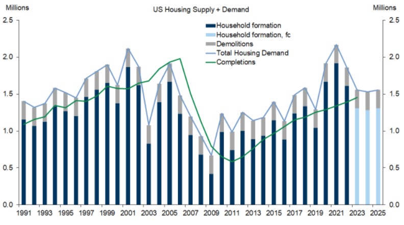
Focus here on the blue horizontal line versus the green line. Currently, the United States needs about 1.5 million homes per year (1.3 million household formations + 250,000 demolitions). From 2003 to 2009, the United States overbuilt about 2 million homes. Since then, we have underbuilt by about 6 million in total. This year, we are on track to complete 1.5 million homes.
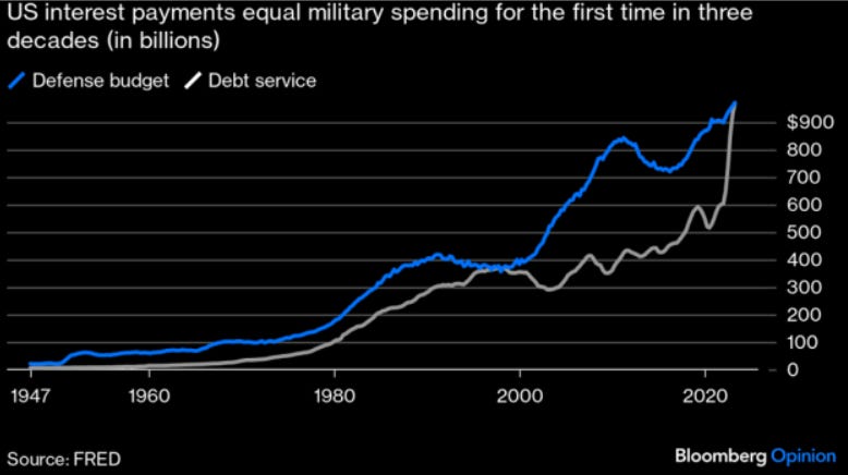
I tend to be an optimist, but this chart from Niall Ferguson (via Bloomberg) is food for thought.


